GRAPHIC DESIGNER. CREATIVE EXPLORER. ARTIST.

Project shortlisted for ArtsThread's Global Design Graduate Show
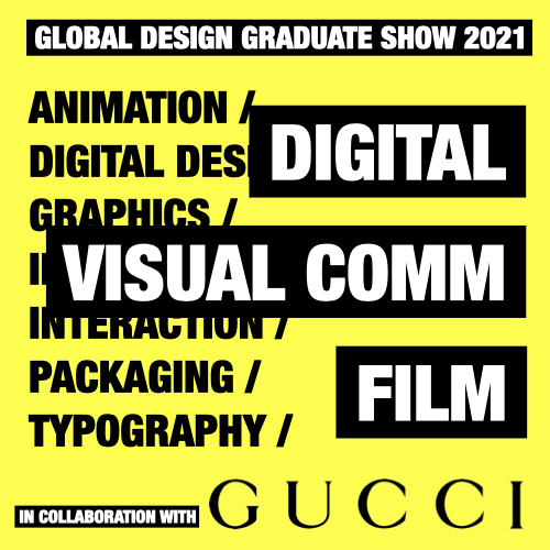
in digital /
/ visual comm / film category
In the final major project, I wanted to combine my two passions, art and design and that's where the idea of a Forma Art Gallery brand identity came from.

LOGO
Each letter of the name can turn into an abstract character.
The result is five variations of the logo.
The contrast between the radical and geometric shapes
of the typeface and the organic flow of hand-drawn letters symbolically express the diversity and complexity of contemporary art represented by the gallery.
The name Forma means “form” in polish.

LOGO EXPERIMENTS

BRAND TOOLKIT
The abstract forms of letters from the logo
initiates a set of the brand graphic elements.
Each letter can be placed in a square frame, creating an abstract icon. The icons together with colour palette and typography create the brand toolkit.
Thanks to the square frame I could experiment with the icons and create interesting complex patterns.


BRAND COLLATERAL

EXHIBITION POSTERS

EXHIBITION SIGNAGE


FORMA SOCIAL MEDIA AND WEBSITE

